
Quip e-Commerce Design
Redesigned the display of payment plan options to drive more sales on Prepay

Overview
Background
In summer 2019, I worked as a UX Design Intern for Quip, a healthcare company focused on dental and oral health. Quip sells the electric toothbrush set on its own e-Commerce store. It has 1 million users. They provide three different payment plan options: Refill, Prepay and One-time Purchase.


Challenge
The current display of payment plan options had resulted in unclarity and confusion about the difference in benefits, items and price between Refill and Prepay.
Due to an inefficient design, it failed to meet the business goal of driving enough attention and sales to Prepay.
Impact
This is a project that focuses on translates research insights into design solutions. I redesigned the display of different payment plan options to drive more sales on the Prepay option. I conducted user testing to find out pain points, then created different versions of mockups and interactive prototypes.
In order to validate and iterate new designs, I conducted 5 different tests with 100 participants. The result was significantly positive.

Discover
Kick off
Prior to design, it is important to understand the problem, the user, the pain points, as well as the product and business goals.

Problem analysis
In order to seek the answers, Here were what I did -
Interviewed stakeholders to understand the problems they wanted to solve primarily and why, as well as the business goal.
Looked up the existing user & marketing research to learn user demographics and personas. I also talked to the growth marketing team to see the problems from looking up the online behavior about how users navigate the shop page.
To empathize the situation, I went through the experience at Quip e-Commerce shop to see how I would feel and what I would be confused about.

Business goal
The company wanted to drive more sales on the Prepay option because the option secured a yearly membership and helped brand awareness.
However, according to the current data, people seldom choose Prepay at the online shop.
Product goal
The problem we wanted to solve primarily is to redesign the display of payment plan options to drive more sales on Prepay. This is because it directly relate to the revenue.
Validated the problem by user testing to figure out what and why consumers were unclear about the price, items, and benefits of different payment plan options.
Reiterated the current one to address the problems.
Define
Usability test
Testing goal and facility
I worked with PM and another designer to write scenarios and tasks, and I worked independently to write down the qualitative and quantitative results. The goal is to understand why consumers don’t choose Prepay, and what other things they were confused about and why.

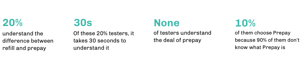
Key findings


Test results
Consumers are unsure about the relation between Refill and Prepay. They don’t see the benefit about Prepay.
The deal is obscure to them. Consumers need to do math to calculate where the "save $5" comes from. $40 + $10 * 3 = $70 vs $65.
Consumers are unclear about the price and what items they get between the two plans
Solution
According to the research result, there are two factors that caused problems.
- Relation between refill and prepay - Is Prepay part of Refill or separate from Refill?
- Price comparison - The current design doesn’t compare the price in the same amount of time.
Therefore, I used a quadrant with two different coordinates (payment plan options vs price comparison) to arrange my thought about the hierarchy. The x-axis is payment plan option, and the y-axis is the price comparison

I went to solution II, this is because:
Showing Prepay as part of the Refill helps to address the relation and highlight the deal.
Showing price comparison under the same amount of time indicates that choosing prepay saves money.
Design
Version A & B
To see what pricing strategies attracts user the most, I created different designs to address the solution II, and validated them through testing.

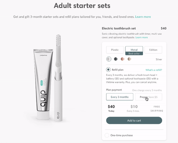
Version A - Set the cheapest payment as default
Use radio button to address the relation between one-time purchase and refill plan
Place prepay inside of the refill section
Use a checkbox and text to highlight the deal - prepay for a year and save $5
Version B - Show the highest price, but default selected the discount card
Use cards to address the relation between one-time purchase and refill plan
Use toggle to address refill and prepay
Use a card to highlight the deal - save 30% today and never run out and highlight the deal about prepay in another page - save 10% with prepay

A & B test
Goal and results
Can testers find out the relation between refill and prepay? How fast are they able to do so?
Can testers find out and understand the deal? How fast?
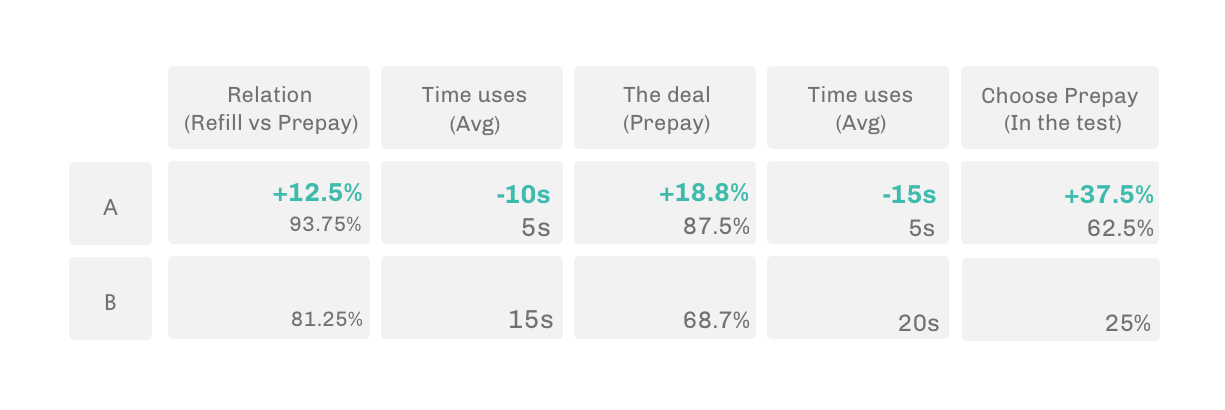
I tested with 16 participants at each version, and here are the results.
Compared to version B, version A had 12.5% more testers understand the relation, and took 10s less for testers to find it out. Version A had 18.8% more testers see the deal, and took 15s less for testers to find it out.
Both version had some people choose Prepay, but version A had 37.5% more choose Prepay
It took 20 seconds less for Version A’s testers to finish the whole experience than Version B’s testers
Design decision
I presented the test result to my manager and product manager, and recommended to use version A. This is because:
The data shows version A got better results than the version B
Version A was designed based on an existing pattern, which does not drastically change the current experience
Some testers felt that version B was somewhat disconnected
Highlight
By default, the shopping card shows the prepay option. That way, users can easily notice the deal. If deselecting the checkbox, the price shows the refill plan option. From the business stand point, the one-time purchase is the least option that we want users to select. However, users can easily do so by clicking the other radio button.


Refill option
One-time purchase


Shopping cart


Refill option
One-time Purchase


Iteration
Test again
To validate the design, I tested 20 participants on both desktop and mobile. The result was promising as there were a lot more people notice the deal of the prepay and the difference between two different payment plan options. However, quite a few people were not sure when the next refill will be charged.

Design

Test result
The goal of this test is to see whether people are clear about the billing cycle of refill, and whether there be more people choose Prepay if they are clear about the billing cycle. I tested 10 people in total, and here were the results.

Comparison
Before
After

Reflection
Find out the actionable insights that the team wanted to validate the problem.
There was a lot going on in the test, making it challenging to find the most useful data. Through talking to the PM, I realized that the actionable insights, such as the cursor movement and the time used to complete the task spoke more than the participants’s answers. I was able to find out the data and validate the problem.
Use a simple and intuitive interaction to display complex information on a limited space.
Displaying complex information with a simple, clean design was challenging. In order to do so, I dived into the design system to understand the existing patterns, sketched various versions of mockups, and asked for feedback from other designers. After several iteration, the new design got positive results from testing and the team.
Think back, I wish I could spend more time with engineers to understand the constraints.
I worked closely with the PM, UX designers and researchers in the summer, but haven’t got a lot of time talking to engineers and understand the technical constraints or problems they may have. I wish I could have learned more about their prospectives to then have a more holistic view to evaluate my works.